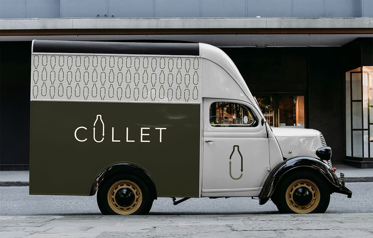
Cullet
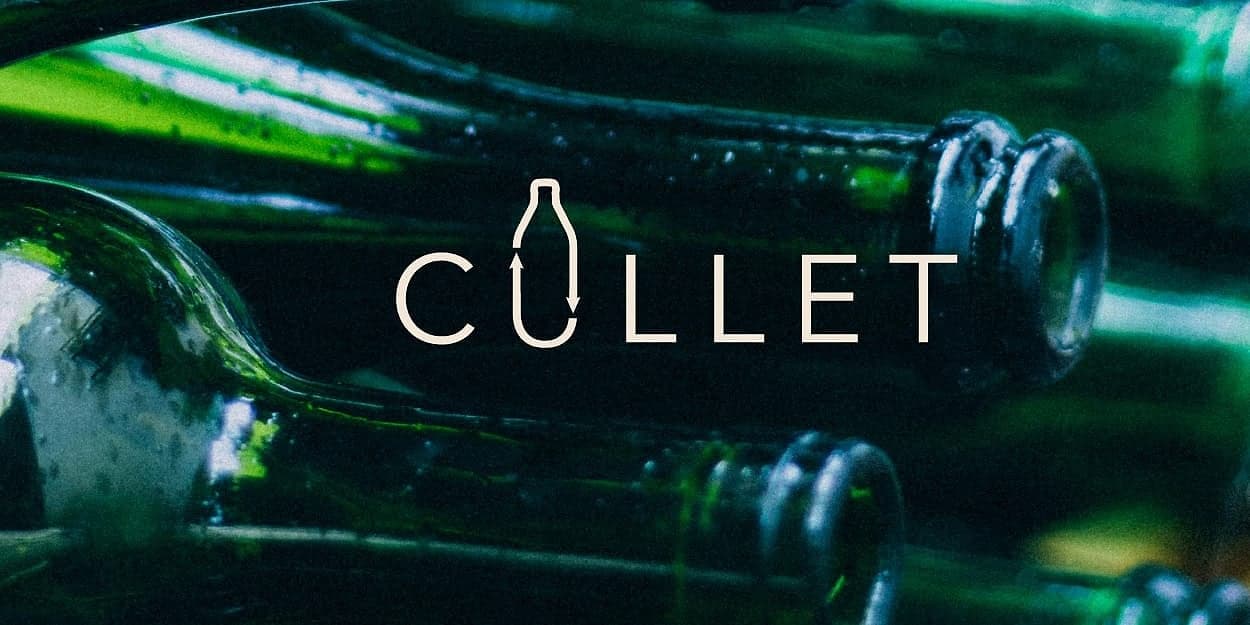
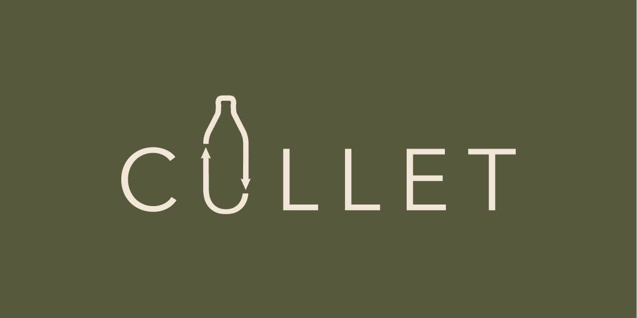
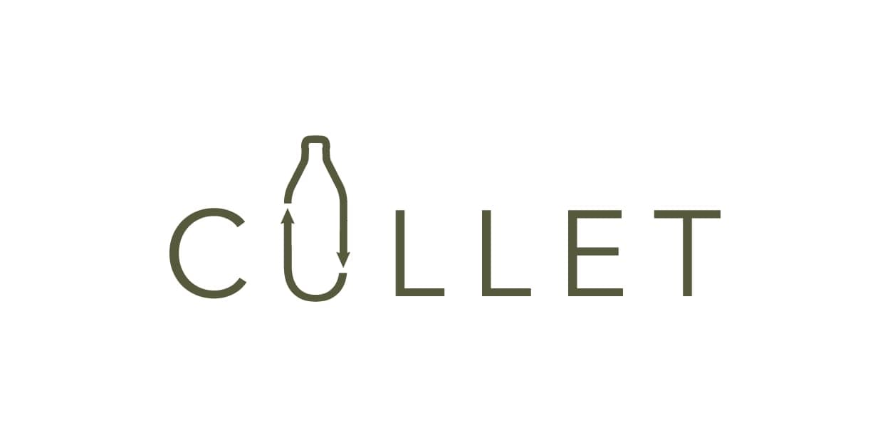
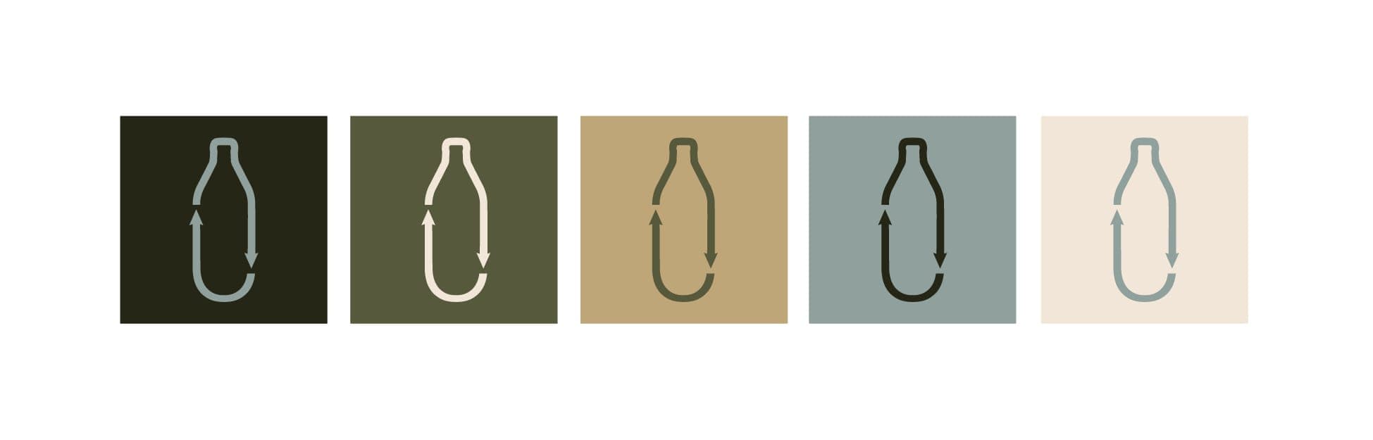
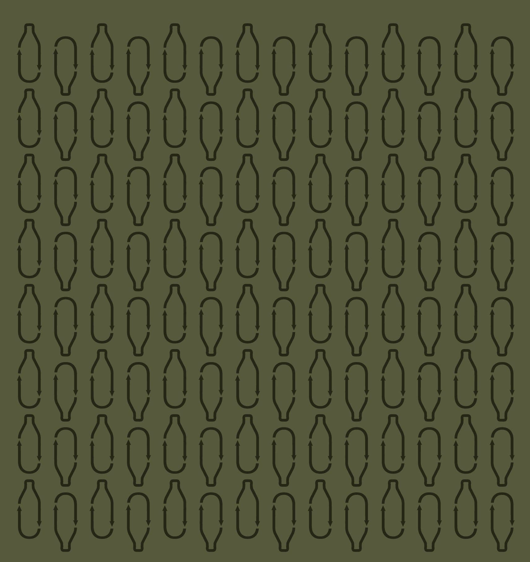
Cullet is a B2B glass bottle recycling startup entering a market dominated by industrial-looking competitors. They needed a brand built from scratch — one that could hold its own in boardrooms and trade shows while signaling that recycling is a modern, premium operation, not an afterthought. The identity centers on a single design move: the "u" in Cullet doubles as a glass bottle form, embedding the company's purpose directly into the wordmark. A supporting pattern system extends the bottle motif across applications, while a confident color palette positions Cullet away from the expected earthy greens of the recycling industry toward something more premium.
The Challenge
Cullet is a B2B glass bottle recycling startup entering a market dominated by industrial-looking competitors. They needed a brand built from scratch — one that could hold its own in boardrooms and trade shows while signaling that recycling is a modern, premium operation, not an afterthought.
The Approach
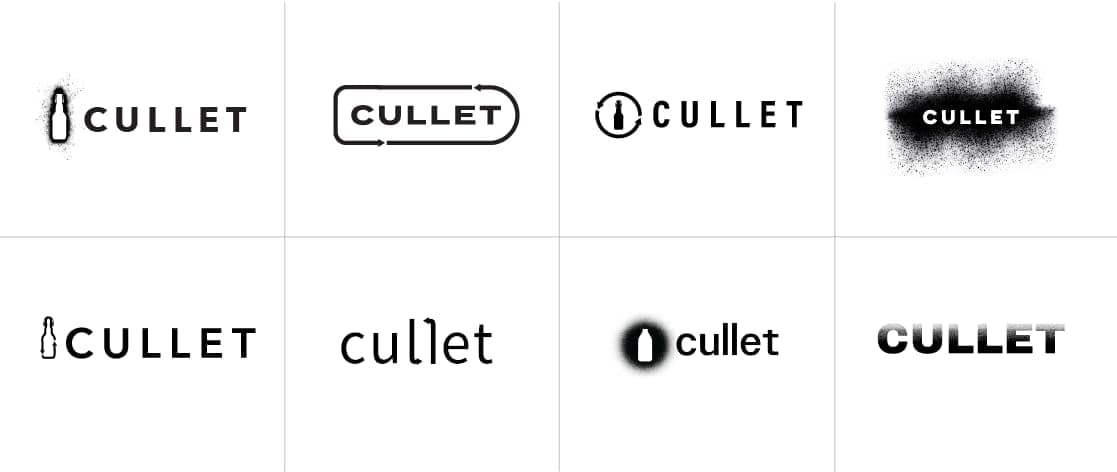
The identity centers on a single design move: the "u" in Cullet doubles as a glass bottle form, embedding the company's purpose directly into the wordmark. It's not a bolt-on icon — it's integrated into the name itself, reinforcing that sustainability isn't separate from the business. It is the business. A supporting pattern system extends the bottle motif across applications, while a clean, modern color palette positions Cullet away from the expected earthy greens of the recycling industry and toward something more confident and premium.
The Result
A complete brand identity — logo, pattern, color palette, and applications — that gives a startup the visual authority of an established player. From embroidered merchandise to client-facing materials, the system scales cleanly and communicates instantly.
Logo Sketches