Battle Bank Launch
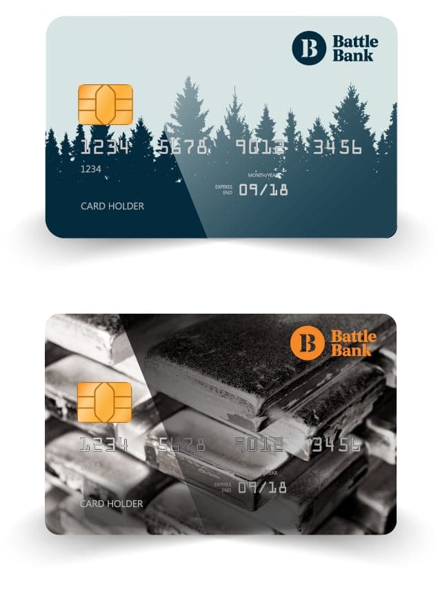
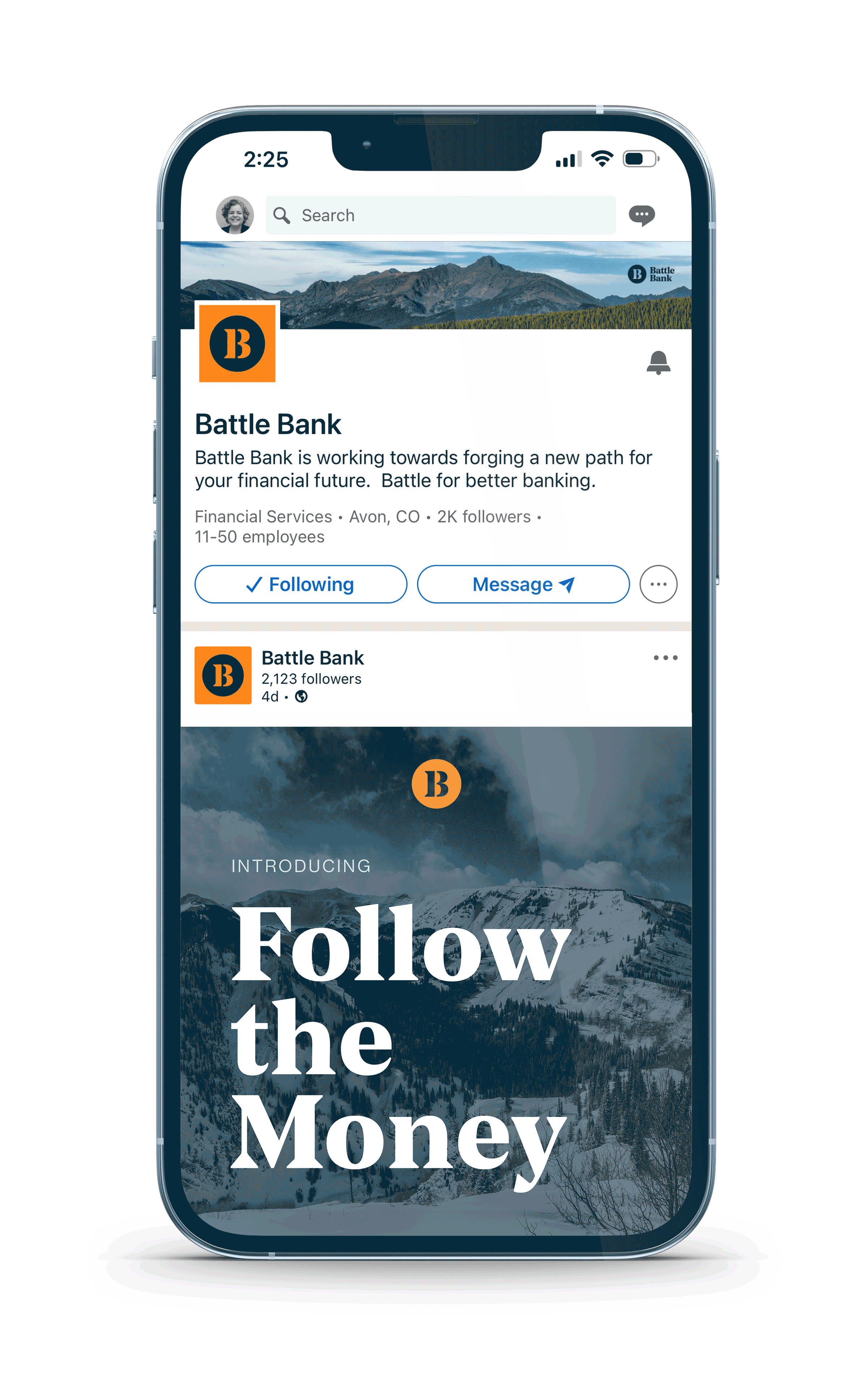
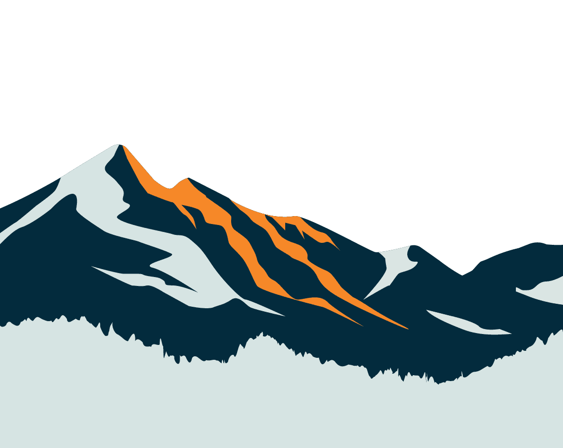
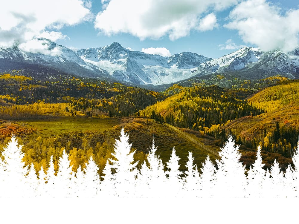
A group of experienced banking industry experts are launching a challenger bank. It was important to create an identity for the bank that stood out from the traditional banks. The mountains of Colorado were an inspiration for the bank and it was important to nod to that throughout the brand touchpoints. As the creative director overseeing the brand and identity of this project, I provided creative and art direction to a team of designers, illustrators and developers.

The Challenge
Battle Bank needed a visual identity that could stand up in a crowded fintech landscape while communicating trust and tenacity. The name demanded a brand that felt bold without being aggressive.


Visual System
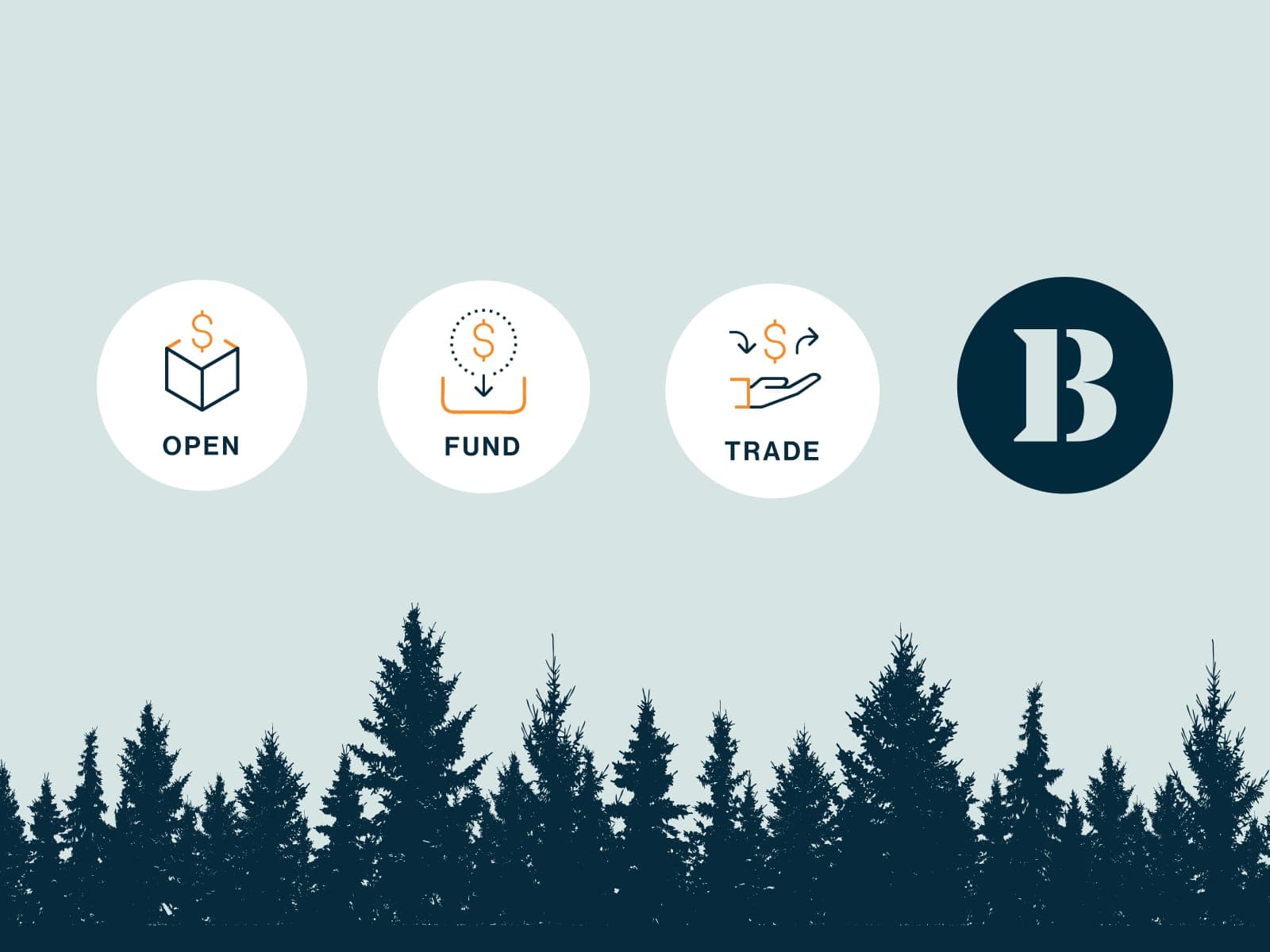
The identity centers on a custom wordmark with sharpened geometry and a supporting system of graphic devices drawn from financial charting. The color palette grounds military greens with warm neutrals and a signal accent.